Amway is the world’s largest direct selling company. The task was to rethink the end-to-end shopping experience of its global eCommerce platform – integrating the new brand identity.
Agency: Publicis Groupe - Digitas North America
My role: User Experience Designer
Team: Commerce/Shopping Experience, Design System
Crafting a brave new shopping experience
It has been years since Amway made a brand refresh… and in 2019, they came to Digitas North America to help them answer and solve one question;
How can we bring new customers into the brand and inspire them to live healthier and more empowered lives?
“Our main goal is to create a clean and delightful online shopping experience that addresses customers' pain points and problems when using and purchasing products on the site.”
Deliverables
Homepage / Product Detail Page / Brand Pages / Category Pages / Product List
Uncovering the users pain points
“The navigation structure is cluttered and confusing.”
— User 11
“The website doesn’t look like an ecommerce site.”
— User 23
“The pages doesn’t promote trust and confidence.”
— User 42
“It’s hard to find a particular product type.”
— User 34
Intentionality in our approach
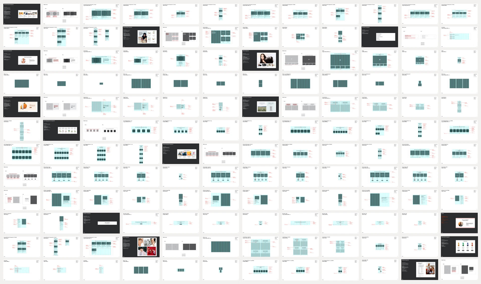
We mapped out the different sections of the site's main pages based on the experience vision, and research findings. We realized that many sections share similar design patterns and structures after we audited the various contents and use cases.

Going to a Modular Design Framework
We went to work and dissected all the different contents and came up with 20+ modules based on the contents use cases. We narrowed the number of content components down to 13 after a series of brainstorming sessions with marketing, content strategy, and engineering teams. These modules served as the building blocks for the pages we created.


Designing with content delivery in mind
We wanted all the content components to be 100% compatible and accommodate a variety of content structures.
Variations
We created variations for each component, such as the image and copy position. We then stress-tested each component by adding the actual imagery and copy with varying character counts. And then stacked them to form various page structures.
Responsiveness
We also created responsive versions for each component to ensure the visual integrity of the design patterns across breakpoint range – from the largest desktop to the smaller mobile screen that Amway supports.
Homepage
The evolved designs
Setting the tone.
The homepage is the first page the customer sees when visiting the site.
We needed to make it is engaging as it sets the tone for the rest of the site's pages.


Promo Area / Categories / Featured Products / Top Sellers /
Editorial Component / Featured Collections / Other Ways to Shop


Product Detail Page
Shopping experience centered in high-quality and consistent design

Designing an effective product detail page was a challenging task–striking the right balance between making the page informative and, at the same time, simple was our utmost priority.
Neatly designed content components
enhance the customer's shopping experience

Variant Selectors


Merchandising Area / Product Details / Similar Products /
Product Information / Testimonials / Reviews / Support


Band Pages
Different.
Distinctive yet cohesive.
Amway has more than a dozen different brands under its umbrella. Making each brand pages look distinctive at the same time cohesive.
Brands under the Amway umbrella


Unique user experience…

…while remaining aligned and
consistent with the brand.

We helped inspire the next generation to live healthier, more empowered lives with the new and evolved shopping experience.


Homapage

Brand Pages

Product Detail Page
Successfully completed.
4 Design epics
200+ Users stories
1K different screens